Adil Najam
Pakistan International Airline (PIA) has new livery. And, I must say, it looks very nice.
Much nicer, certainly, than the last back-fin livery they had (the ill proportioned waving flag). That one just did not work, especially with the white background to  the plane. Always seemed like it was an after-thought that did not do justice to the flag or the aeroplane.
I should also confess that when I first heard that these new designs were coming, I did not much like the idea. Why must every airline try to follow the British Airways example? On this one, however, I will admit that I was wrong. Whoever has done these designs have done a good job.
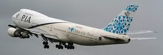
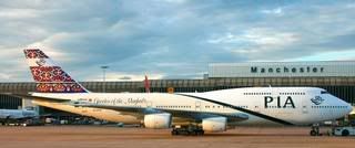
I am told that there are four designs (one for each province) and they are all depicted here. Additional designs may come. Pay particular attention, also, to the name and city of each plane. The four depicted here are: Thar: Colours of the Desert (in light shades of blue); Lahore: Garden of the Mughals (strong reds and blues); Peshawar: Gateway to the East (red and green on earthy 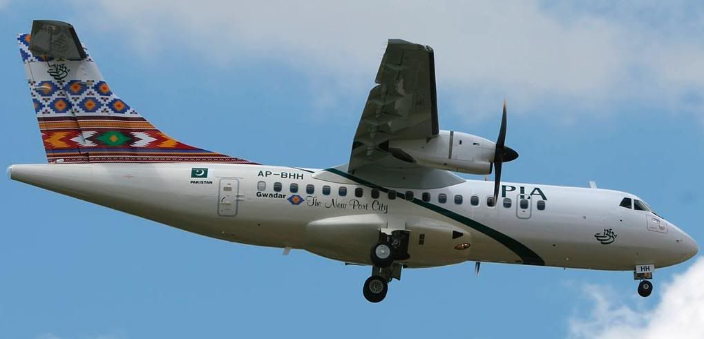 yellow); Gwadar: The New Port City (bold yellow, red, green and blue).
Altamash Mir and iFaqeer, please note the name of the Lahore plane; we do acknowledge our Mughal past… sometimes! (Although, I should add, there are some aspects of our ‘Mughal heritage’ that I am neither proud of nor do I wish to own or emulate; e.g., imprisoning one’s partents and killing one’s siblings).
And, yes, I did note that the Baluchistan plane is smaller and older than all the others. I hope there is no hidden meaning in that!
All pictures courtesy of Jetphotos.net.
Let our Afridi brothers put more colorful paintings on the airplanes just like they do on the trucks and busses.
They may add some poetry and words of wisdom as well. One of the quote scribed just above the driver seat and clearly visible to the passengers was “Ask for forgiveness, this may be your last journey” I remember it very well. Perhaps it suits PIA too.
When we visit Pakistan, our goal always is to fly PIA – I must add that flight crew is always nice, the ground crew is another story. Overall, service has declined.
Amazing. Got directed back here through the Karachi blog. It is a small world.
Had never seen this one before. Really like teh first picture… plane with blue tail.
New livery very gorgeous! i love the Colours of the Desert (blues). Its good to follow good examples like for livery Why must every airline try to follow the British Airways example? One thing i must add Green stripes running through the body of plane reflects exactly the same stripe as on EL AL Isreal airlines well they have blue colour stripe, even whites are the same and they have flag thing too, visit website. ;)
The problem with PIA is inside the cabin, not outside (wink). Earlier this year, to support the good work the new PIA MD is putting in, I decided to skip Singapore Airlines/Malaysian/Emirates and flew PIA. I made a mistake. First, the flight was three hours late, second the crew just didn’t give a flying f*** about service and third it was darn uncomfortable. The biryani was great (I wanted seconds) but then the whole cabin and my clothes smelled like Student’s biryani for several days; the seats were so uncomfortable that I had a backache in just two hours! While in Pakistan, I flew a new airline called Airblu – and loved it. PIA has a wonderful heritage as an airline – and its wonderful only because capable and committed men and women took pride in their work. When I lived in Singapore, a senior SIA executive once told me when SIA was starting out in the late 1960s, some of the key people behind it were Pakistanis from PIA (we helped lauch Emirates also, I think). Look were SIA and Emirates are now and where Please Inform Allah is!
HJ
I do love the new designs too! I would agree.. the blue one looks gorgeous with the white of the body. Not too sure about the new PIA logo with that green stripe. I think the logo should be the standard logo in bold Sans-Serif font as it used to be with a large stylized-Urdu insignia just behind it and to its left. And no green stripe.
Just my design background coming through. :)
Anyway.. I do like the blue tail!