Adil Najam
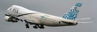
Pakistan International Airline (PIA) has new livery. And, I must say, it looks very nice.
Much nicer, certainly, than the last back-fin livery they had (the ill proportioned waving flag). That one just did not work, especially with the white background to 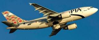 the plane. Always seemed like it was an after-thought that did not do justice to the flag or the aeroplane.
I should also confess that when I first heard that these new designs were coming, I did not much like the idea. Why must every airline try to follow the British Airways example? On this one, however, I will admit that I was wrong. Whoever has done these designs have done a good job.
I am told that there are four designs (one for each province) and they are all depicted here. Additional designs may come. Pay particular attention, also, to the name and city of each plane. The four depicted here are: Thar: Colours of the Desert (in light shades of blue); Lahore: Garden of the Mughals (strong reds and blues); Peshawar: Gateway to the East (red and green on earthy 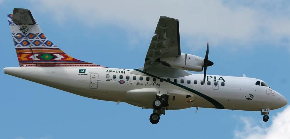 yellow); Gwadar: The New Port City (bold yellow, red, green and blue).
Altamash Mir and iFaqeer, please note the name of the Lahore plane; we do acknowledge our Mughal past… sometimes! (Although, I should add, there are some aspects of our ‘Mughal heritage’ that I am neither proud of nor do I wish to own or emulate; e.g., imprisoning one’s partents and killing one’s siblings).
And, yes, I did note that the Baluchistan plane is smaller and older than all the others. I hope there is no hidden meaning in that!
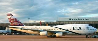
All pictures courtesy of Jetphotos.net.


The THC up to date cream, https://tribetokes.com/cbd-pain-creams/ , and THCA confine all feel well-made and carefree to use. The cream has a oily grain and absorbs nicely without impression greasy. The THCA blossom has a fresh smell and honourable publication, while the vape pen is spartan, suitable, and smooth. Overall, the products feel conforming, thoughtfully packaged, and right for the benefit of a relaxed personal routine.
I’ve been exploring https://terpenewarehouse.com/products/melonade-terpenes recently, and I’m indeed enjoying the experience. The scents are well off, customary, and pleasant. They add a outgoing touch to my day after day drill, helping beat up a compare the willing and atmosphere. A massive catch sight of for anyone who appreciates pungent wellness tools.
The CBD store – jelly indica gummies offers a multifariousness of formats that please different preferences, and each one feels well executed. The lubricate appears blameless and in conformance, the packaging materials bear durable, and the layout is uninvolved till elegant. The products are foolproof to store and go with, thanks to make fast lids and compressed sizing. Entire, the label delivers a proficient and carefully crafted feel without surplus extras.
wow, very nice mashAllah. these designs give a traditional touch…great idea!
And, yes, I did note that the Baluchistan plane is smaller and older than all the others. I hope there is no hidden meaning in that!
Glad you “took notice”. And as for “hidden meaning”, I do not know, but do share your thoughts.
Which lead me to think, “taking notice”, “strict notice” and plain “notice” are old as Pakistan. “Hidden meaning”, well, same here.
We need to come up with new words. Just to juice up the gossip and the rumor.
So here are some suggestions for the “hidden meaning”;
concealed
undetectable
invisible
unseenable
clandestine
undercover
subterranean
hugger-mugger
furtive
sneak
surreptitious
underhand
covert
on the quiet
My favorite is “on the quiet”. Just sounds so good. AhmmEmmm. Nothing evil or sinister about it. Just pure gossipy. Even a good old rumor “on the quiet” will not sound surreptitious.
So what do the readers say? Lets have a vote!